Digital Me- Centre for entrepreneurship

Digital Me- Dewi Gray

An introduction into freelance and business

Centre for entrepreneurship

Every business has business within them making that one company what it is. Understand what you do and how you do it and why someone else should want it?

Would you like to decide the style of graphic works you do? A business would tell you what you would design. You need to have the ability to be able to sell yourself this is difficult why people end up in employment. People telling you that you can’t do it. You have the ability to make it happen.

“This path is not for everyone. It is not the easiest or the fastest. However, if you want to live the life you have to go further than everyone else.”

What are the client buying they are buying you and your designs because they can’t draw they need you which means you have more experience you don’t need a degree to be creative.

Basic steps as a student

  • Study – design your own learning – feed your own learning
  • Apply what you learn
  • Sell what you have
  • Sell to people you know – easiest people to sell too
  • Don’t live in the shadows -Portfolio and style
  • Do it now
  • Get to know more people
  • Learn how to conduct a business transaction
  • Make a lot of mistakes – if your not your not learning
  • Build a portfolio

Basic steps as a graduate 

  • Have a portfolio
  • Know who you like to work with
  • Know how to sell yourself
  • Confident in your work

“The point is there are things that are better to do at Uni, like learning and messing up. After graduation time is against you”

Our target for you 

  • Get plugged in get online
  • Work with start ups at Cardiff Met
  • Find work experience through Santander Internships
  • Work on a collaboration with another studen
  • Complete a business model canvas
  • Run a crowdfunding campaign
  • Work with 10 different industries (outside of design)
  • Sell a service, a product and someone else

Smartphone connect you with everyone in the plant.

What do we mean by value?

Starbucks have the value because we perceive it as better

  • Perception
  • Need
  • Idea -the physical product on the idea behind it
  • Skill

Cost how much it cost you – what you actually sell it for – the value is what it is worth

Its not just the design it to guide them though the process


Drink awareness process

For this drink awareness video my idea involved filming. I wanted my idea to look like a snapchat story of a drunken night out. I wanted it to feature my one friend tom who is a first year. I decided that using a first year would connect more with the target audience. The filming I needed was shot of pre drink, the night out, the walk home and the getting back home to halls. My one problem was the fact that snapchat is portrait so I wanted to see if this would work in other ways. When discussing this idea in university as feedback the decision was made to keep it portrait. I then wanted the voice over to be from a sober point of view telling themselfs to stop and think about what they are doing.
I gathered videos from actually nights out along with shot I took myself to help the video make sense and relate to my idea.

This is the script that will be recorded over the tom of the footage:-

University is both social and actually getting the degree. With this comes alcohol.

I always find I drink way too many at Pre-drink and now I’m thinking about it why didn’t I just slow down. The start of shots are never a good idea and I always feel pressured into them but don’t allow yourself to be pressured.

I hope the neighbour never heard us last night I don’t want to make a bad impression for the university.

I seem to always find myself having a few too many. I never seem to consider the number of units I’m drinking when on a night out the recommended amount is 14 units a week and I drink more than that on just one night.

I wish I paste myself and drank water in-between each drink.  I am not thinking about the amount I am drinking at all. I also spent my taxi money on entry in to the club how am I going to get home now.

I shouldn’t have chosen to walk home alone I shouldn’t have left the group on a night out and wish I’d stayed with everyone. I could have put myself in danger or others around me.

Why didn’t I stop Sam from cooking last night being that drunk she should have never cooked pasta she could have set the house on fire.

I should have stopped her instead I sat there and filmed her.

You can find the balance and enjoy the university life with ease.

I want my video to be current because the last video made was very outdated and I don’t want mine to be like that. My original plan was a documentary style video but I think this is a outdated way so I looked into using the social media route.

MountBoard Models

From the ideas we have generated we needed to start making models initially in mount board. I began by sketching out my favourite three designs further to show them from different angles before trying to make a model from it.

I have worked with mount board before but I much prefer cardboard as it is easier to cut and glue together. Although our final design will hopefully slot together I chose to attach our models together with a glue gun to show the basic form as it would be easier with such a small scale.

The first is my design based off of the Big ben chair because she loved London so I wanted to see what it would look like in 3D form. The second idea was my book shelve idea. I wanted to see if this would work and once creating it I realised it would use to much wood to create it.

My final model was based off the idea of storage and shelves. I wanted it to look like a chair from the front but the surprise would be the shelve in the back. All of these ideas worked well in 3D models but all of them would have used to much material and were very much just square there was no aspects of design.

I think this 3D mont board models really helped me to get a sense of what my sketches would look like. I think it helped me decided that these idea weren’t good enough and that I needed to go back to the drawing board and get idea from my partner and use this together with my ideas to get a really good design together.


Are you sitting Comfortably? – Initial Ideas

We went back over our mood board we created that visually represented the ideas and concept given to us in the interview. I came up with a basic range of ideas that linked to things Angie liked. I came up with a variety of different ideas all linking to a different fact about her.

The things that stood out to me was her love for beaches in India and her love of London and the band LED Zeppelin. These ideas we wanted to incorporate into our designs. I also wanted to use the fact she wanted storage within my rough designs.

The ideas I came up with were pretty simple using a book shelve and a shelve in with different chair ideas.  My first ideas were a series of chairs that had a shelve or book shelve somewhere to use as storage these idea were good but wouldn’t work with the amount of material we had.

IMG_0932

IMG_0933

My second idea is linking in with the idea that she likes London so I used the Big Ben in a chair idea. This was a good idea initially but I think it was to obviously and didn’t really have a nice design to it.  I also feel like it looks like a church chair which means I would have to use paint to make sure the design would come through.

img_0934.jpg

This idea was a deckchair feel that also had storage underneath because she loves beaches but also wanted storage within her chair. I felt that this idea was good but again felt to simple and used to much wood.

img_0935.jpg

This idea is my favourite cause its simple but also has a book shelve incorporated into it. This design wouldn’t work because it wouldn’t have any strength in the chair because theirs nothing to hold it up because of the chair.

IMG_0936

This is another version of the chair above but also using the idea of her love for India so I wanted to bring the Indian pattern into the chair as well as the book shelve.

IMG_0937

I realised that all these design would work but they didn’t really challenge the concept that the client questionnaire gave us. They all feel to obvious as a design. I wanted the design to feel more subtle where it hints the idea but not straight away.

Are you sitting comfortably?

After our client interviews we came up with a mood-board to really pin point the likes and dislike of our client. This was to help us when it came to design the chair as a point to look back on and get inspiration from. The mood board gave me a real sense of the client overall. The key point I took age was the fact she love India and their beaches and also the band Led Zeppelin. I research about the band symbols and found that each member have a unique symbols that they use. This symbol I felt could be used as a design aspect to give our chair a pattern. I also gave a thought about the Indian beaches and how we could use this in our chair. I was thinking we could use the deck chair and loungers as inspiration.

Screen Shot 2017-12-10 at 15.55.59.png

I wanted to make sure that the used of India beaches was used within my chair but used only as a slight hint so it didn’t over power the whole design. We also drew five sketches of five chairs using different chairs around the room getting a 3D sketch, side, front and back with dimensions and a line drawing. This was to help us get a sense of drawing chairs. To also look at the different dimension of chairs and how they each vary. I found this task really helpful but some of the chair I chose I didn’t find hard to just look for the one view as I kept wanting to draw in 3D because that is what I could see in front of me.


With our 3D drawing we used our line drawings to create wire versions. This was to get a sense of what  3D chair would look like. This helped me to see my drawings come to life. As much as a 3D drawing helps more than a flat drawing put it I think a wire model helps bring the 3D drawing make more sense to me.

I believe that this mood board help me get a better sense of the design aspects of our chairs. As it gave use a good sense of what she likes and her interest in one page. I felt this would help when it came to designing our chair because we could use this too look back on. I also found the 3D drawings helpful because it gave me a sense of the different design aspect of chairs. What works and what don’t work within each chair. Also helped to use dimension in our drawings to get a sense of what we could use for our own chairs.


On display – Final outcome

This project I have found challenge and defiantly a lot more work than i’m use to.  The brief was to animate a moving identity Promotional installation / spatial communication Ephemera (including both printed and digital outcomes i.e. posters, brochures, app, web, product) Visuals of how a signage & wayfinding systems works within the space.

My reflection on physcogeography is all about the direction of people for me going to the centre of Cardiff  and to University is very direct whereas a person unfamiliar with the area would take a whole different route. My idea for this brand was to use my journey from cathay which is student area of town and compare it to someone unfamiliar with the area. This is how I decided on my mark my mark has been made to be personal to me using my handwriting as the typeface.

I looked at company like Disney and harrods that have use handwritten fonts within there works and how they have used that writing identity throughout their brand. This inspired my idea to use my handwriting within my work. I used it within my logo and wanted to bring the whole thing together by also using it throughout my brand.

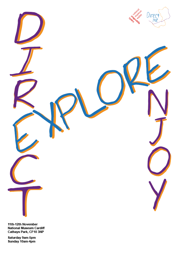
I want my brand to help people explore Cardiff but also be able to get to places quickly using my route. My poster display my Exhibition and clearly flow the same colours as my logo. The brand strap line is Direct, Explore enjoy which I have clearly used in my poster as through looking at other poster there logo isn’t the centre of attention the strap line or saying is.

I wanted to make a leaflet that clearly show where the exhibition was using my mark to show where it was. I wanted people to be able to get there using the leaflet and once there have flag to easily display where to go next. I showed my brand displaying flags outside the museum to easily display where the exhibition is. I also used a flag inside to show where exactly it was and also used the lines from my logo to create arrow that helped to show where to go within the building.

My animation will be displayed within my website so people will recognise the brand and I have also used my line throughout my website to keep a clearly link to everything else.

DIRECT ME FINAL 1

Final Logo

Final Outcome for my posters

Final Website

Way-finding and signage


Website Development

Website development

My website needed to display my brand with and with out the logo. I came up with a few idea of how to use the lines as the theme i would use throughout. I also thought about using my typeface within the website to connect it to everything else. I did a few sketches on how I wanted the website to look.

My website needed to display my brand with so I decided to use the line within my logo in the top bar of the website along with my logo. I also put all my information for each web page in the middle because i felt this worked well.

When thinking about other website I thought that they don’t always use there logo on every page. Once on another tap the top display normally opens up. So I use the line alone the whole of the top and use the logo only on the home page. I felt the lines needed to be the mark of my website. I feel the line were the thing that made the website link to the brand.


Poster Development

My recent one to one tutorial I decided I needed to change the colour of my marque mean that my whole brand had to change. I was told that my poster layout worked but the colour behind the black wasn’t working. When being told this I understood and felt I needed to play around with colour more using a colour scheme. My colour scheme now is purple, orange and blue. I was also told that the typeface i’ve been using is to heavy and is normally associated with boring documents. When coming away from this I felt that the only way to make the typeface better was to make it link with my logo as the type I used on the logo I hadn’t used anywhere else and the work felt very separate.

I wanted to use my handwriting typeface throughout my work so I created the three works using my typeface to see if it would work. When putting it into my poster it straight away brought the whole thing together. I also wanted to see if it would still work with the 3d effect on the word. This was then the typeface I used throughout my brand that brought the whole thing together.

Screen Shot 2017-11-05 at 19.02.50

Screen Shot 2017-11-02 at 12.39.37

This was using the layout from my previous poster idea changing the type and the mark. The typeface changes the whole poster and make it look more playful. The colour made it more playful and I used the alternation in the colour to bring it to life more.

I wanted to be more experimental with the type placing and try to put them together using letter that were in both words. This was to play around with the space more. Screen Shot 2017-11-02 at 15.45.01Screen Shot 2017-11-05 at 19.18.47

These place with the space more but also leave blank space that I think work because the typeface is so bright and playful. It would be to clutter if I had more on the page.

I want to use three poster as my final piece and I was most drawn to the two where I experimented with type and wanted to use the one with the three text in the middle with the line in the background.

Animation for Direct Me

For my animation I wanted it to be the logo moving. My idea was to make the lines move to show the path being made. I also wanted the text to type itself or create itself using shapes.

I began with import all three part of my logo. This was so I could make them move separately. I first wanted to make the line of my mark move to make the path and meet in the middle. I also wanted to make the type move to create the letters whilst the path is being made.

I did this by in my first comp adding all my image to make my logo separate and lining them up so they displayed my logo. I right clicked on the orange line and changed the vector into a shape. I then added a path ,stroke and a trim path. In Trim path I put both the start and the end to 0.0% then at 4 second I changed the percentage to 100% I then pressed the path timer at the begging and this allowed the line to draw itself. I did the same for the purple line and the Direct Me words. Screen Shot 2017-11-06 at 11.30.57.png

After I had my logo moving I want to add the lines from my logo coming in before had all over the screen. To do this I used another comp and added the lines how I wanted them on the screen and used the same technique as before but for some of the line I changed them so they started from a different end.

Screen Shot 2017-11-06 at 11.34.42.png

I also was told in my tutorial that I would need a strap line at the end to some up my brand. So I used a third comp and added the work Direct, explore and enjoy separately so I could use them to move around the screen after my logo. I wanted each word come from a different direction. So I used position and placed them off the screen at the beginning then change the percentage at 4.00 seconds so they would all move on the screen.

My final animation is displayed below:

Ephemera – Poster Ideas for Direct Me

For one of my ephemera for this project I wanted to make a poster that displayed the place and time of the expeditions. I wanted my poster to display the logo and the date and time. I played around with a few ideas.

I wanted to use my mark and my three tag lines to create a couple of posters that can show my expedition. I used the colours within my mark to start.

I used bold tag lines to show what direct me was about. I wanted the writing to be in bold to make it eye-catching and easy to read. I first went with the landscape idea using just black writing and the logo. I felt this was boring and needed more colour. I used the colours with in the line and made the word look 3D by putting colour behind each of the words.

This then brought me on to the fact that the mark was to big. When researching poster the logo are alway small and they let the strap line do the taking. So I wanted to play with that idea and making the strap line bigger and centre of attention. I decided to try it portrait and make the three bold words in the centre.

Screen Shot 2017-10-29 at 18.40.11

I think this poster layout work the most as the mark is clear and so is the strap lines. I still need to work on where I am going to place the information and if I am going to play around with the type more. I have used Arial black font for the strap lines and Arial for the informations.